
AMUSE IO (Stockholm, Sweden)
Basics
COMPANY
Amuse io
INDUSTRY
Music distribution
LOCATION
Stockholm, Sweden
USERS
1 million +
DEVICE
Mobile & web
My role
As the solo designer in the team, I was responsible for the user experience and designing of the entire insights section on both the mobile and web app.
Summary
I redesigned the whole analytics page for both of Amuse's outdated mobile and web apps that no longer met user's needs. Mentioned as a ‘game-changer in the independent music landscape in 2023’, this project was one of the most valuable features for our users in the past few years.
Impact
DAU (daily active users) - up by 61%
MAU (monthly active users) of the Insights page - up by average 5 times per user
Chosen as users’ most liked feature within the Amuse app (Survey Feb 2023)
Business Problem
Lack of engagement
One of the problems we identified on the Amuse app was the lack of engagement after the users submitted their releases. The existing insights page was too basic and was not serving users’ needs. Our hypothesis was that for independent artists, understanding artist performances was crucial and - by improving the analytics - we could increase the engagement rate.


The design before the project - data is too basic and doesn’t meet user expectation.
User Challenge
Analytics for both big & small artists
As the Our target audience was all artists on our platform. This included big and small artists, at all different stages of their music career. For established artists who had large number of streams, there was lots of information we could provide. However for small artists who had barely no streams, we did not have enough data to display quantitative insights. The biggest challenge was, how to create interesting analytics for small artists who have very few streams?

Example of a small artist who has very few number of streams.
User Challenge
Improve stickiness
As mentioned above, one of the problems in our app was the lack of engagement after the artists have submitted their music on the app. 40% of our users checked the Insights tab once a week, and rest of 60% said that although they check out their performances on a daily basis, they are using other platforms to do this and not the Amuse app. Therefore our goal was to increase the amount of users who interact on the insights tab on a daily (DAU) & weekly (WAU) basis.
User Insights
The more data the better
One of our hypothesis before we conducted the user interviews was that for small artists they will be demotivated to create new music if they see the poor performance of their streams. However, after the user interviews, it was evident that their performance did not affect the motivation towards music creation.

An affinity mapping after the user interviews - gathered by topic.
Insights:
More data is better.
Artists wanted to see data in one place.
Artists wanted more guidance around how to use data.
Looking at data does not affect how artists create music, even if they only have few streams.
Artists didn’t care so much about the number of followers on socials.
Artists wanted to know how much their track is used on socials.
Artists checked analytics very frequently, especially on the release day.
Users used data for marketing purposes. (creating and monitoring ad efforts)


Insights deck were shared with the team.
MARKET ANALYSIS
Big opportunity in the UGC space

UX analysis to analyse the best UX approaches in music analytics
UX analysis
With below objectives, I analysed the UX of our competitor platforms to: find out the analytic metrics artists are used to. examine the best UX approaches of rival music analytics platforms. discover business opportunities. It was evident from the analysis that there was a great opportunity around providing social and UGC (user generated content) related data as this was the information that most of the competitors could not provide.
Metrics comparison
Alongside the UX analysis, I conducted a metrics comparison to find out different metrics among our competitor analytics. This allowed me to understand essential metrics that most competitor platforms have and to cover minimal metrics that were expected by our users.
STRATEGY
Create a place that has it all
Our strategy was to create a place that has it all. As a distributor, we were able to collect data from various stores and put it in one place. This was a great strength that no one individual store could provide. Another strength was that we could provide data on social media. Although this was more tricky as most of the social media companies don’t provide the necessary data, we were determined to get this data in our analytics as it was one of the most desired piece of information from the users.

Metrics comparison to find out metrics measured by competitors.
TECHNICAL CHALLENGE
Data come in different shapes
As a designer, the biggest challenge was to organise data that came in different shapes and sizes from various stores. For example, we received data from stores in different schedules. This meant that on the line chart, Spotify would have yesterday’s information whilst Deezer and Amazon Music would have data up until the day before.

Some of the music stores that we could have in our analytics


3 design options I created. After further discussion with the stakeholders about the pros and cons, we decided to go ahead with option 2 - that shows the "as-is" data sent from each stores.
WIREFRAMES
Future proof navigation
My focus in creating the wireframes was a long-term view that allows us to add more pages and sections in the future. The main navigation and the stream count per store are both scrollable horizontally, so we can add more sections/stores. At this stage, the team got together on a number of occasions and discussed the foundation of the insights section - such as the date range, the use of filters and the information architecture.


Wireframes with a focus on content growth in the future.
STORYTELL WITH DATA
How do we use data for story telling?
Analytics gets interesting the more raw data you have. On the other side, there is very little to show if there is not much data in the first place, 76% of our users had less than 1,000 streams a month (33 streams/day). So, the question was, how do you make interesting analytics when the user is an emerging artist with very few number of streams? We wanted to tell a story by providing data. For example, rather than displaying merely the percentage of the actual source of streams (i.e. organic, editorial & algorithmic playlists), we decided to show the percentage of ‘Engaged’ and ‘Lean Back’ listeners. This told a much better story for the artists about the engagement level of the listeners.

We decided to show the percentage of ‘Engaged’ and ‘Lean Back’ listeners to help users understand the level of engagement of their listeners.
USABILITY TEST REFLECTION
Redo information architecture
After the usability testing for the web app, there was a clear need to reorganise the information architecture. Many participants were getting overwhelmed about having too much information on one page. To solve this issue, I added tabs onto each page to divide it into smaller sections. This was an effective design, not only to reduce the information intake on one page, but to accompany the metrics that were to be added in the future.

Users were overwhelmed with the amount of information on one page. After the usability test, we decided to add tabs to breakdown the information.
MOBILE FIRST
Charts for small screens
Considering our mobile first approach, we made a navigational change. I initially designed a stacked line chart to align the design with the web app. However, on a small screen it was difficult to see the multiple lines particularly when there was a big difference in numbers. The solution was to display only the summary on the main page and create subpages for deep diving.

THE CHALLENGE
Long-term plans
In order to examine the long term value of our analytics, I created a metrics sheet to get a 360 degrees value of the possible features that we have extracted from our user research. I then talked to various stakeholders to understand the value from their perspectives scoring each features from 0 (least desired) to 5 (most desired). This was not to make a decision on what to build next, but rather to start a conversation that allowed us to understand the priorities among different stakeholders, once we have set the desired outcome.
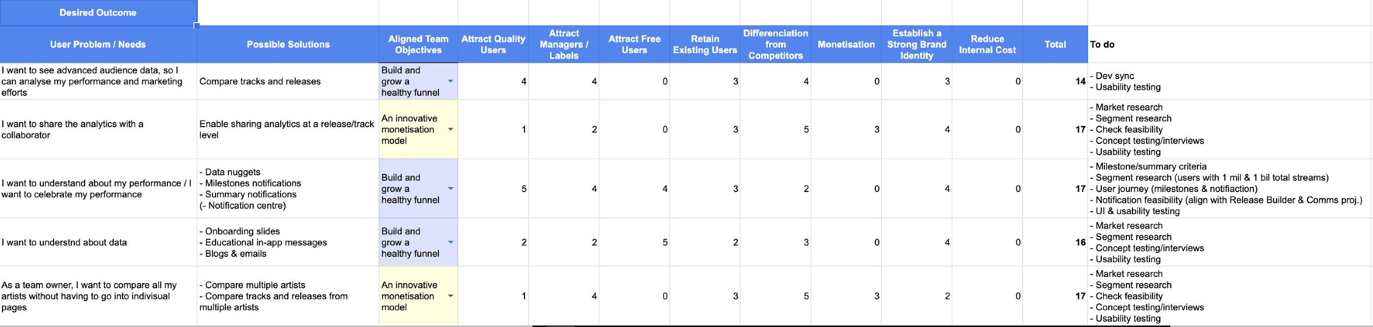
Metrics sheet to understand the priorities among different stakeholders.
MOBILE FIRST
Charts for small screens
Considering our mobile first approach, we made a navigational change. I initially designed a stacked line chart to align the design with the web app. However, on a small screen it was difficult to see the multiple lines particularly when there was a big difference in numbers. The solution was to display only the summary on the main page and create subpages for deep diving.

Chosen as users’ most liked feature with the Amuse app (Feb 2023)
The impact
The redesign of the insights page had a significantly positive response from our users. Although it was too soon to measure all the impact at the time of writing (1 month after the launch of the last phase of the project), here are some of the impacts 6 months after the launch of the first phase:
DAU (daily active users) - up by 61%
MAU (monthly active users) of the Insights page - up by average 5 times per user
Chosen as users’ most liked feature within the Amuse app (Survey Feb 2023)


