
Volvo Cars (Stockholm, Sweden)
Basics
COMPANY
Volvo Cars
INDUSTRY
Automobile
LOCATION
Stockholm, Sweden
USERS
100+
DEVICE
Web
My role
The first 4 weeks, I collaborated with another senior designer. After this period, I worked as a solo designer in the team, responsible for the product discovery, business stakeholder management, and the user experience of the web application.
Summary
With limited user input and a process largely driven by business stakeholders, I developed short- and long-term strategies to meet the deadline while, most importantly, building direct relationships with users and turned around a product that was 'difficult to use' to 'far exceeded my expectations'.
Impact (expected by the end of 2027)
Minimize unwanted speculation vehicles by 35% (5,000 vehicles).
Additional 1% vehicle sales with overall efficiency & granularity in planning.
Improve sales and production request planning by 0,4% (vehicles).
Assumption: Lower pipeline/stock of 1000 units for 3 months.
THE PROBLEM
A business driven tool with little user input
The Apollo sales forecasting tool was initially developed with a strong business perspective but very little input from the actual users - sales planners across global markets. It focused heavily on data and process standardization, with little consideration for user workflows or usability. As a result, the tool lacked the needs and clarity that users needed. This misalignment led to low confidence in the tool and delayed adoption.

The product team had no direct communication with the actual users.
THE RISK
The users not using the product because it’s difficult to use
Before I joined the team, a usability test had been conducted about a month earlier. During that session, users gave concerning feedback - comments like “the tool is too difficult to use” and “it doesn’t meet our needs” highlighted a disconnect between the product and its intended users. This wasn’t just a UX issue; it represented a serious adoption risk.
THE CHALLENGE
“You only have 3 weeks”
Time was a major constraint. We had only three weeks to understand the users, assess the current tool, and deliver meaningful improvements that could be developed quickly. In that short timeframe, we needed to audit the existing product, identify pain points, validate findings with users, and align with business stakeholders. We couldn’t solve everything at once, so prioritisation became critical.

We only had 3 weeks to design until product launch.
IDENTIFYING THE PROBELM
UX audit
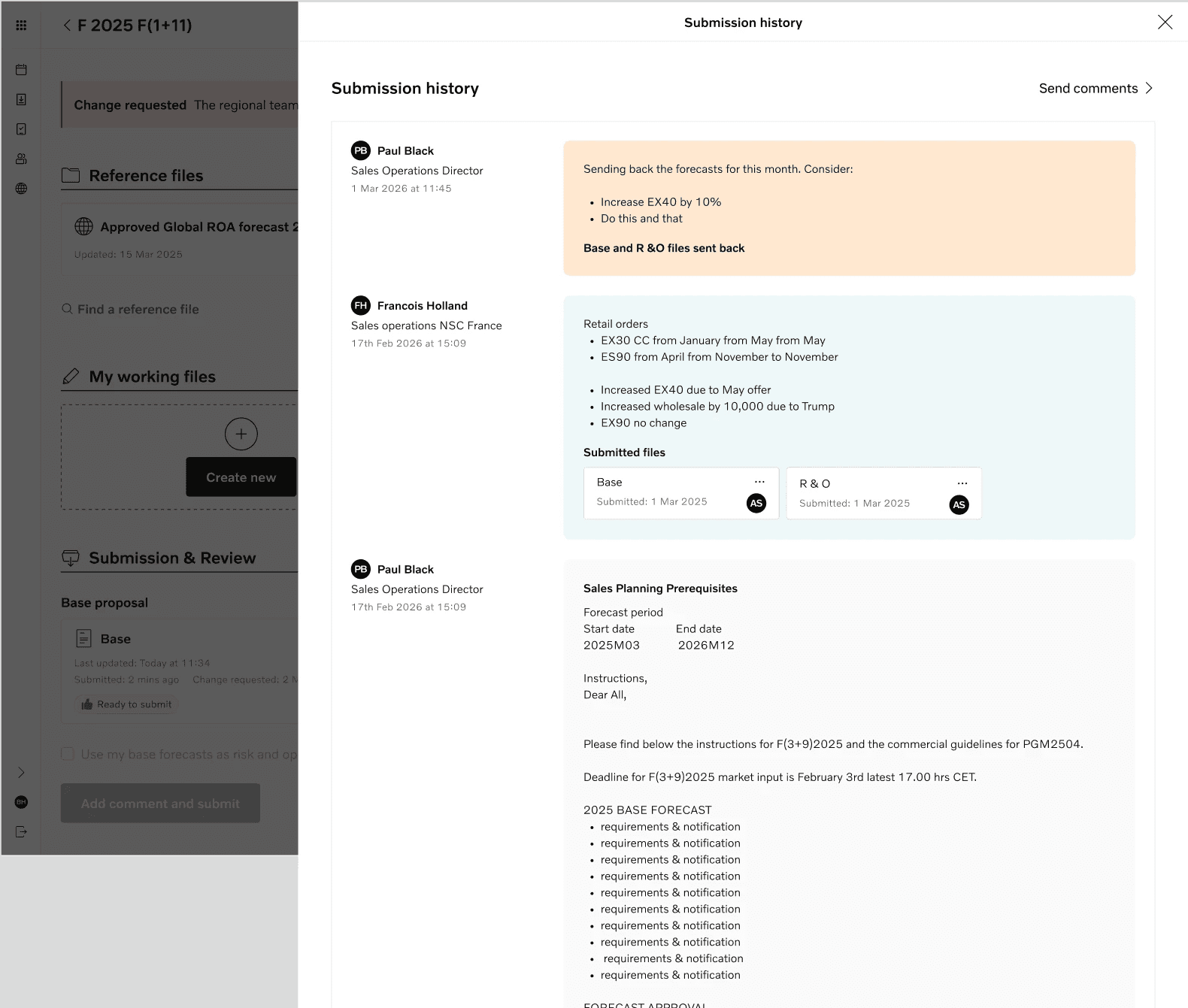
We started with a UX audit of the live tool. This included heuristic evaluation, and mapping the end-to-end user flow. We identified several critical usability issues: unclear navigation, inconsistent terminology, and disconnected workflows. Our audit findings became the foundation for prioritizing design work.

From the UX audit, it was clear that there were critical issues in navigation and workflows.
USER INSIGHTS
No common process
Through interviews and observation sessions with users in different markets, we learned each market followed slightly different workflows using different calculations. This variability made it difficult to design a one-size-fits-all solution. However, we identified a common task shared across segments: the need to compare one data set against another. While the long-term product strategy would need to support more flexible workflows, we chose to focus our short-term design efforts on enabling this shared task.

Each market followed slightly different workflows using different calculations.
THE CHALLENGE
3 gaps identified
Our research revealed three major disconnects.
a gap between business needs and user needs—what the tool was designed to achieve vs. how users needed it to function.
a gap between different user segments (e.g., central, regional, and market planners), all of whom had different priorities and workflows.
a knowledge gap between business stakeholders and the product team, leading to assumptions that didn’t reflect actual usage.
These gaps caused confusion, duplicated effort, and slow adoption.

Major gaps identified between teams and stakeholders.
WIREFRAME
Navigation that aligns with the workflow
The original tool's structure didn’t align with users’ actual workflow. In redesigning it, I focused on the core task flow — referencing files, creating and editing working files, and submitting them. We also introduced a comparison space, allowing users to easily compare any two files. By aligning the navigation with the natural forecasting process, we reduced cognitive load and improved usability.
Before

After
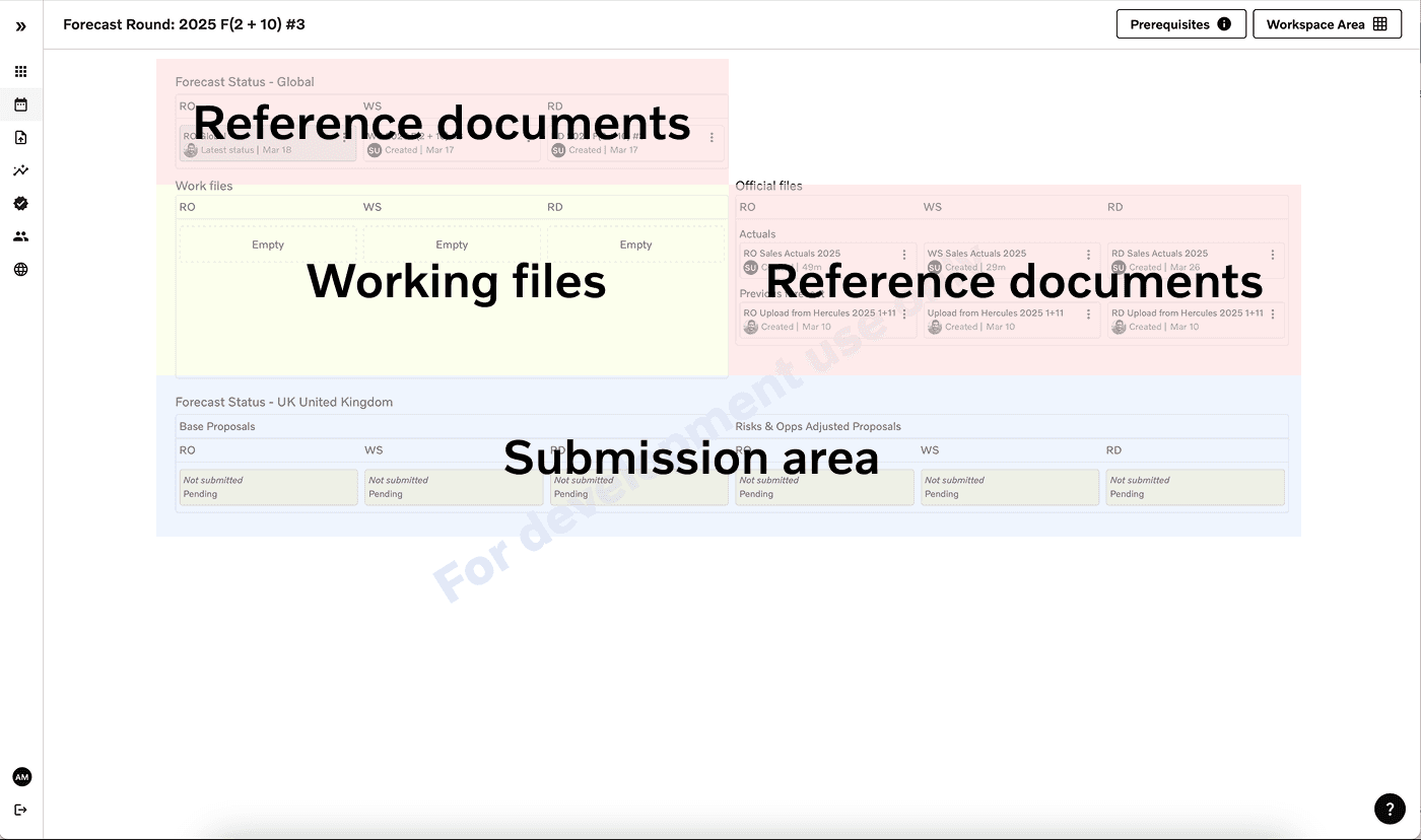
In the new design, I improved the zoning to align with the user work flow.
THE CHALLENGE
Business stakeholder collaboration
I facilitated several workshops with business stakeholders to align on priorities and integrate user needs. In one key session, we mapped out when and how to address the user pain points uncovered during research. This exercise encouraged stakeholders to think more from a user-centered perspective.

I created a user journey that highlighted the size of the pain points, helping me initiate discussions with stakeholders about how we could address them.
Short-term solution
Our short-term solution focused on three things: navigation, sectioning, and basic interaction improvements. These included: restructure of the forecast page to align with the workflow, group related components to reduce cognitive load, made the submit action more visible and reassuring, and clear error messages.

Our short-term solution focused on three things: navigation, sectioning, and basic interaction improvements.
Vision workshop
To shape the longer-term roadmap, we ran a vision workshop with planners from different markets and levels. We mapped out the current pain points across different user journeys. We also asked each group to define what a “successful forecasting” looked like for them. This surfaced common values - accuracy, strategy, efficiency, and transparency. The workshop helped unify the team around a shared vision and created a foundation for future development priorities.


Workshop board to understand user pain points and successful sales planning
Long-term strategy
Looking ahead, our vision is to design a standardised yet flexible forecasting process that can scale across all 70 global markets. This involves establishing a clear, repeatable flow for creating and submitting sales forecast inputs, regardless of market size or maturity. In parallel, we’re also designing a shared framework for building simulations and evaluating their outcomes, enabling markets to experiment with different scenarios in a structured way. The goal is to reduce complexity, improve consistency and reduce inventory stock at company level.


Major gaps identified between teams and stakeholders.
Impact so far
After the initial redesign, we presented the updated tool to 20 European markets during a live demo session. Each market had hands-on time with the tool, and we gathered real-time feedback. The response was overwhelmingly positive, with comments like “Far exceeded my expectations” and “A great step towards efficiency for us and for the company.” For the first time, users felt the tool was aligned with their needs and easy to work with. Engagement and confidence increased significantly, validating our user-centered approach.
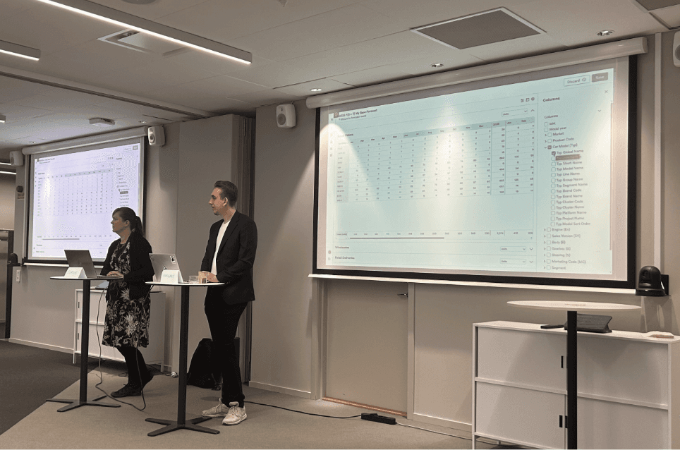

Our team developers demoing the tool infront of users.
Expected outcome
As a result of integrating the forecasting tool across 70 markets, 5 regions, and the global sales planning team, we anticipate the following impacts by the end of 2026:
1. Minimize unwanted speculation vehicles by 35% (5,000 vehicles).
2. Additional 1% vehicle sales with overall efficiency & granularity in planning.
3. Improve sales and production request planning by 0,4% (vehicles).
Assumption: Lower pipeline/stock of 1000 units for 3 months.